Meeting: ArtWorks 2 with Richard Ashbery
WROCC member Richard Ashbery returned for another of his talks on the use of ArtWorks 2 – this time to look at what can be done with the Crystal transparency tools. Armed with a giant-size inflatable beach ball, he set about showing how its likeness could be created quickly, easily and very effectively on the computer screen.
Report by Steve Fryatt
Our August meeting saw a return visit from Richard Ashbery, who was taking another look at the things which can be done using the ArtWorks 2 vector graphics package developed by Martin Würthner. On arrival, visitors were greeted by a slideshow of images created using a number of Xara tutorials as inspiration: Richard recommended that anyone interested in learning more about the software should have a look for these on the internet.
Crystal effects
A common theme running through the slideshow was transparency: the ‘crystal’ tool has been part of ArtWorks for a number of years now (having been introduced by Martin early on in his stewardship), and it allows many different effects to be produced.
The transparency tool allows objects, or groups of objects, to be made fully or partially transparent so that objects behind them show through. Three effects are available: ‘mix’ gives a fairly intuitive effect, while ‘bleach’ and ‘stained glass’ offer alternative options. Just as with colour fills, transparency can be applied in a flat layer to all of the object, or it can have a linear or radial property applied.
To demonstrate some of the facilities, Richard said that he was going to create a ‘3D’ image of a beach-ball – to help us visualise what was required, he had come armed with a handy prop. The design would have vertical stripes on it, and the real ball clearly showed how perspective made the ones in the centre of our field of view appear wider than those at the edge.
Theory into practice
To produce a set of stripes, Richard showed us how to use the blend tool in a slightly unexpected way. He created the two ends of the run, then blended between them to add a set of evenly spaced stripes between them. However, while this was quick and easy it meant that all of the stripes were the same width: no use for producing the required perspective effect.
Instead, Richard resorted to a manual approach and drew the individual rectangles by hand. This wasn’t as difficult as it sounds, and soon he had a striped square containing thicker bands at the centre and thinner ones heading out towards the edges. It wasn’t entirely clear at this stage how a stripey square would help to create a beach-ball, but we were assured that this would soon become apparent.
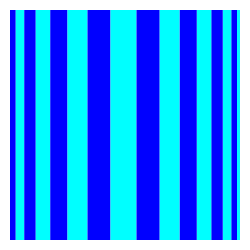
The next step was to group the objects in the square and apply an envelope to squash the square into a circular shape. Richard pushed the corners of the square together at the top and bottom, and adjusted the envelope’s control points to bring the sides towards the correct shape. The process was effectively the reverse of that used by the Mercator Projection for mapping the spherical globe on to a single flat map.
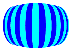
After a bit of adjustment with the help of guidelines drawn on the ArtWorks page, the square had become something very close to a circle with the bands converging correctly at the top and bottom. To perfect the shape, Richard applied a circular clipview to remove any stray edges.
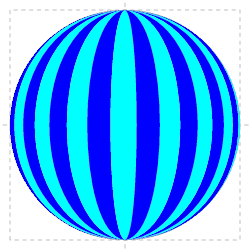
The next step was to add a graduated background, using a simple rectangle behind the circle with a straight graduated fill applied. With this done, the final stage was to add some lighting effects.
Shadows and light
The shadow under the ball was the first effect to be added. Richard took an ellipse with the same graduated fill as the background, and a smaller one filled black, then blended the two together to create the desired effect. This was then positioned to give the impression that the light was shining from above and the to the left of the ball.
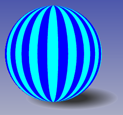
To give the ball the effect of shadow, Richard took a copy of the circle used for the clipview and filled it in black. Using the crystal tool, he then applied a graduated ‘mix’ transparency using one of the non-linear profiles and ranging from 100% transparent (at the points of light) to 30% transparent at the depth of the shadows. When this circle was overlaid on the ball, the varying transparency gave the effect of light and shadow. I suspect that a similar use of transparency could also have been used to produce the floor shadow (instead of the blend technique).
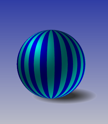
The finished graphic can be seen below, showing the power of ArtWorks 2 in the right hands.
